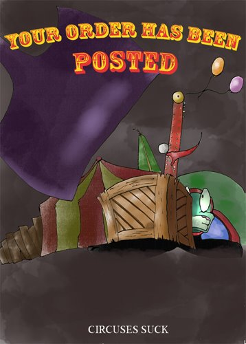
Backgrounds so here is a background design painted in Photoshop below is the original
the next two are with filters applied the first being a dry brush filter
and a poster edges filter
I just wanted to put these up to see what people thought about the filters, if either one helps improve the image or if the original works fine on its own.
Saturday, 29 November 2008
cute robots
Ahh!! character work my peers, I need to re-think through my character. the following applies to my character:
1. cute
2. self-centred
3. easily distracted
4. arrogant
5. panicky
his character should aesthetically be:
1. cute
2. flexible face
3.anthropomorphic
here are some robots i found about the ol' net that resemble cute
All of them have anthropomorphic qualities, another similarity is the rounded body parts. in recent years the design of robots have changed to a smoother, more polished aesthetic. Wall-E is a good example of our new ideas of robotics all of course being Wall-E, being a relic.
although its a tangent, another point i'd like to raise is the similarities between johnny 5 and Wall-E
Both of these characters are considered cute, but what differences are there? neither have legs and instead use tracks, both have arms with three digits, neither of them have faces aside from giants eyes. Of course there differences are within there body structure and size. Wall-E is small and wide framed to resemble puppy fat, he's also extremely small,causing him to always look up with his droopy eyes. Johnny 5 is different in that his frame and structure is thin and lanky, causing him to be appear fragile, but is equal to an adult in height making him far less appealing than his modern counterpart.
in order for me to develop a character looking at the more anthropomorphic design, tiny and wide, with large eyes and a tiny body in comparison to its large head..........very similar to my old design in fact. still must roll with the times
1. cute
2. self-centred
3. easily distracted
4. arrogant
5. panicky
his character should aesthetically be:
1. cute
2. flexible face
3.anthropomorphic
here are some robots i found about the ol' net that resemble cute
All of them have anthropomorphic qualities, another similarity is the rounded body parts. in recent years the design of robots have changed to a smoother, more polished aesthetic. Wall-E is a good example of our new ideas of robotics all of course being Wall-E, being a relic.
although its a tangent, another point i'd like to raise is the similarities between johnny 5 and Wall-E
Both of these characters are considered cute, but what differences are there? neither have legs and instead use tracks, both have arms with three digits, neither of them have faces aside from giants eyes. Of course there differences are within there body structure and size. Wall-E is small and wide framed to resemble puppy fat, he's also extremely small,causing him to always look up with his droopy eyes. Johnny 5 is different in that his frame and structure is thin and lanky, causing him to be appear fragile, but is equal to an adult in height making him far less appealing than his modern counterpart.
in order for me to develop a character looking at the more anthropomorphic design, tiny and wide, with large eyes and a tiny body in comparison to its large head..........very similar to my old design in fact. still must roll with the times
Saturday, 22 November 2008
An Adoraball Scream
the music
Music is something that's very important to cinema, overpowering, underscoring or its absence make an effect on the audience and assists in the narrative and emotions. i've looked at a lot of music and a lot of music within animation. I think that some of the greater music within animation is like that of ren and stimpy using classical music. i've been thinking a lot about Brass instruments and more of a big band or swing sound for the chase sequence.
below are links to youtube videos of the sort of music i've been thinking about
http://uk.youtube.com/watch?v=D44pyeEvhcQ
http://uk.youtube.com/watch?v=SBZAbLUOxWM
below are links to youtube videos of the sort of music i've been thinking about
http://uk.youtube.com/watch?v=D44pyeEvhcQ
http://uk.youtube.com/watch?v=SBZAbLUOxWM
The Aesthetic and Acting
For my film i've been looking at a host of stuff, and thinking about what it is that I want, stylistically, from my animation.
these images are from Courage the Cowardly Dog and Ren & Stimpy, both I think are Great examples of exaggerated animation, visually exiting and compelling.
another quality from both of these cartoons is the destruction of the background for violent colours and scattered blots (as the Ren and Stimpy image above) causing the back ground to be effect by the characters emotions.
Another show that i hold in high regard is Invader Zim. This cartoon holds the same qualities as the above but in this blog i'm more concerned by its colouring, Compared to the above cartoons Invader Zim has blocked drastic colouring with thick bold lines and has a more contemporary and neat look. with this style of colouring and line art in place it makes the exaggerations far more instant and stark.
Monday, 10 November 2008
character design
Saturday, 8 November 2008
Subscribe to:
Posts (Atom)